worked at: Home Assignment Responsibilities: UI

Background
Puls make your home work so you can make everything else work. Whether it's a phone, a TV, or a home appliance, our priority is to make quality installations and repairs effortless, so you can focus on what matters most.
My Assignment
Puls has decided to offer its customers home warranty membership subscription plans.
We hope that by offering relevant subscription plans to customers, they will not only save more on their yearly home services, but we will help increase our repeat customer rate as well. We wish to offer 3 different subscriptions plans, with varying benefits and pricing.
Goals
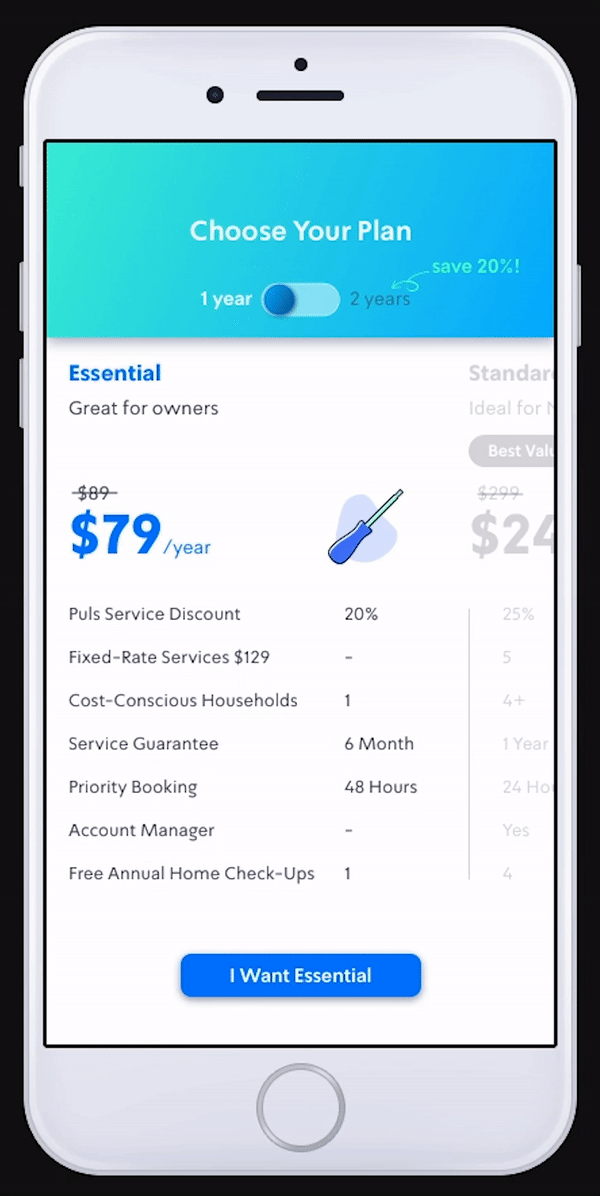
Improved Comparability
Introduced side-by-side comparisons with bold highlights for key differences, enabling users to identify the right plan at a glance.
Interactive Feedback
Added hover effects and visual indicators to show active selections, creating a smoother decision-making process.
Enhanced CTAs
Designed individual buttons for each plan to give users direct and clear actions for choosing the desired subscription.
Pain Points from Design Review
To address Puls' new home warranty membership plans, I analyzed the existing subscription page and identified key usability issues
Lack of Comparability
Users struggle to easily compare the benefits and features of different plans due to the layout and lack of clear highlights.
Unclear Plan Selection
No visual feedback or clear indication is provided when hovering over or selecting a plan, making the process unintuitive.
Single Call-to-Action (CTA)
The single "Add Puls+ Pro" button limits flexibility and might confuse users when exploring other plans.
Inspiration


colors
UI Design

Updated Color Palette
To enhance the brand's signature blue, I introduced a complementary palette with vibrant shades of teal, pink, and deeper blues. These supporting colors provide visual contrast and versatility, ensuring a fresh and dynamic interface while maintaining brand consistency.
Custom Icon Series Design
The icon series was thoughtfully designed to reflect the progression of each subscription plan. Starting with a simple tool for the basic plan and evolving into a complete toolbox for the Pro plan, the icons visually represent the increasing value and benefits of each tier. This approach ensures a clear and intuitive representation of the plans, aligning with the user’s journey and the brand’s messaging.


Users struggle to easily compare the benefits and features of different plans